
Hompages
Inner Pages
Essential pages
Get 8+ Premium Framer Templates
Made by FramerBite
Explore Now
Listen to Onward Upward Podcast!
Hosted by me :)
Listen to Onward Upward Podcast!
Hosted by me :)
Listen to Onward Upward Podcast!
Hosted by me :)
Listen to Onward Upward Podcast!
Hosted by me :)
Listen to Onward Upward Podcast!
Hosted by me :)
Listen to Onward Upward Podcast!
Hosted by me :)
Coho Design System
Created an unified design governance from 0 to 1 to improve branding, consistency, documentation, & process scalability.
50%
Handoff Time Reduced
85%
Improved Collaboration & Transparency
My Role
My Role
My Role
Brand Designer
Design Systems Designer
UX/UI Designer
Brand Designer
Design Systems Designer
UX/UI Designer
Brand Designer
Design Systems Designer
UX/UI Designer
Deliverables
Deliverables
Deliverables
Design System for Web, Blog, Brand, Marketing Collateral, & Developer Handoff
Design System for Web, Blog, Brand, Marketing Collateral, & Developer Handoff
Design System for Web, Blog, Brand, Marketing Collateral, & Developer Handoff
Team
Team
Team
Designer: Sierra Ching (me)
Marketing/Growth: Kasra Khalili
CEO: Mindaugas Petrutis
Engineer: Keith Wealleans
Designer: Sierra Ching (me)
Marketing/Growth: Kasra Khalili
CEO: Mindaugas Petrutis
Engineer: Keith Wealleans
Designer: Sierra Ching (me)
Marketing/Growth: Kasra Khalili
CEO: Mindaugas Petrutis
Engineer: Keith Wealleans
Timeline
Timeline
Timeline
4 Months
4 Months
4 Months

In mid 2022, I embarked on a journey as the founding designer at Coho to craft a design system for the startup's early marketing, operations, and engineering teams.
The overarching goals for this design system was to improve design processes, ensure brand consistency, facilitate communication, and create scalable workflows.
The overarching goals for this design system was to improve design processes, ensure brand consistency, facilitate communication, and create scalable workflows.
This endeavor was hatched after many months of planning — poring over best practices, benchmarking competitors, and aligning our founding team. However, one critical element I couldn't nail down from the start…governance.
An effective design system requires clear governance to set precedence.
But what makes establishing governance so tricky?
To fully grasp this challenge as a founding team member, I interviewed stakeholders including our CEO, marketing, ops, and developers.
Chats uncovered a myriad of perspectives and needs. After synthesizing the key points and insights, a few common themes emerged…
Chats uncovered a myriad of perspectives and needs. After synthesizing the key points and insights, a few common themes emerged…
Sierra
Product Designer

"As our only designer, I want creative freedom but need guardrails to ensure consistency."
Kasra
Marketing Lead
"We need the freedom to get creative with our branding campaigns, but guidelines ensure we stay on brand."
Keith
Developer
"Clear specifications enable us to build efficiently, but leaving room for necessary customization is important."
Ash
Ops IC
"Having standardized processes helps us scale, but being adaptable is crucial for our dynamic environment."
These formed some telling insights about our early stage personas:
Design values creative expression with constraints
Marketing want both consistency and flexibility
Development desire clear specifications to build fast
Operations needs standardized processes but also adaptability
These formed some telling insights about our early stage personas:
Design values creative expression with constraints
Marketing want both consistency and flexibility
Development desire clear specifications to build fast
Operations needs standardized processes but also adaptability
Maintaining these personas and their varying requirements, I encountered two obstacles to overcome.
Challenge 01
Challenge 01
Challenge 01
Design and deliver a stellar brand with brand identity, logo, colors, typography, and patterns.
Design and deliver a stellar brand with brand identity, logo, colors, typography, and patterns.
Challenge 02
Challenge 02
Challenge 02
Design and deliver a unified governance that encompassed foundations, systems, components, accessibility, and design tokens.
Design and deliver a unified governance that encompassed foundations, systems, components, accessibility, and design tokens.
The impact of the design system at Coho
Reduction in time spent on handoff to developers
Improved collaboration and transparency
Sierra
Founding Designer
We now have a robust toolkit that empowers more autonomy while ensuring brand alignment.

The impact of Blueprint Blog by Coho
Subscribers in less than 6 months
Improved collaboration and transparency
The impact of the design system at Coho
Reduction in time spent on handoff to developers
Improved collaboration and transparency
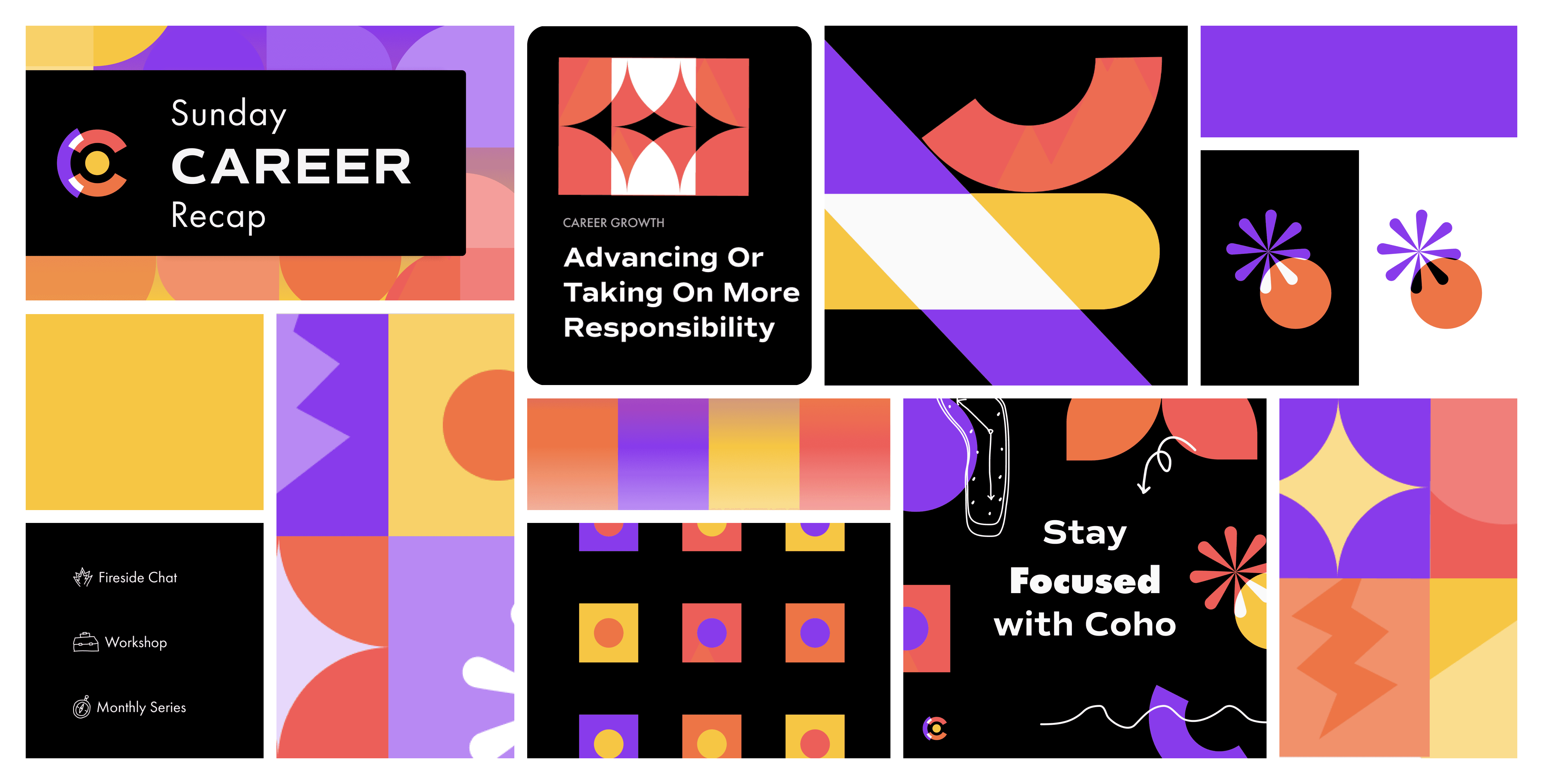
Solution 01: Design & Deliver a Brand
I collaborated with cross-functional team members in order to brainstorm and iterate upon the company branding, including a style guide, logo, colors, typography, mood boards, and brand identity.
I collaborated with cross-functional team members in order to brainstorm and iterate upon the company branding, including a style guide, logo, colors, typography, mood boards, and brand identity.
Final Results

Solution 02: Unified Design System
The design system needed to include clear governance for effective
async handoff and collaboration in Figma for branding, marketing,
and website designs.
Overall Goal: Improve the design process, ensure brand consistency,
facilitate communication, and create scalable components & processes.
The design system needed to include clear governance for effective
async handoff and collaboration in Figma for branding, marketing,
and website designs.
Overall Goal: Improve the design process, ensure brand consistency, facilitate communication, and create scalable components & processes.
The design system needed to include clear governance for effective async handoff and collaboration in Figma for branding, marketing, and website designs.
Overall Goal: Improve the design process, ensure brand consistency, facilitate communication, and create scalable components & processes.

Foundations
Foundations
Foundations
Establishing core building blocks that all systems and components are derived from.
Establishing core building blocks that all systems and components are derived from.
Establishing core building blocks that all systems and components are derived from.

Design Tokens
Design Tokens
Design Tokens
Codifying visual properties like colors, fonts, and hierarchy into variables to enable flexibility and consistency across environments.
Codifying visual properties like colors, fonts, and hierarchy into variables to enable flexibility and consistency across environments.
Codifying visual properties like colors, fonts, and hierarchy into variables to enable flexibility and consistency across environments.
Accessibility
Accessibility
Accessibility
Ensuring inclusive experiences by adhering to accessibility standards, conducting audits, and rectifying issues.
Ensuring inclusive experiences by adhering to accessibility standards, conducting audits, and rectifying issues.
Ensuring inclusive experiences by adhering to accessibility standards, conducting audits, and rectifying issues.
Systems
Systems
Systems
Documenting higher level patterns to guide complex interfaces.
Documenting higher level patterns to guide complex interfaces.
Documenting higher level patterns to guide complex interfaces.
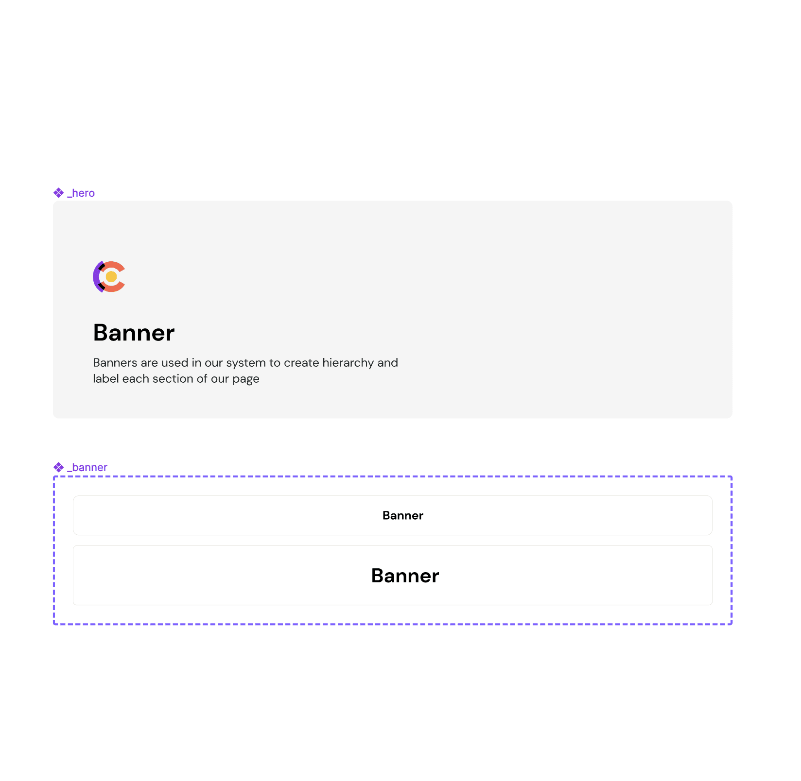
Design System Breakdown: Foundations
I used variant table blocks to document the foundations of the components that made up the designs for Coho.
Each system block had its own variant table as well. Within each foundation page, hero blocks, banners, & panels were further used to structure and document effectively.
I used variant table blocks to document the foundations of the components that made up the designs for Coho.
Each system block had its own variant table as well. Within each foundation page, hero blocks, banners, & panels were further used to structure and document effectively.
Scaleable Components
Scaleable Components
Scaleable Components
The foundations in the design system were chosen based on components that would cascade throughout designs and be used for
styling to maintain brand consistency amongst color & typography.
The foundations in the design system were chosen based on components that would cascade throughout designs and be used for
styling to maintain brand consistency amongst color & typography.
The foundations in the design system were chosen based on components that would cascade throughout designs and be used for styling to maintain brand consistency amongst color & typography.

Anatomy Documentation
Anatomy Documentation
Anatomy Documentation
Component tables were broken down to help document the anatomy and role of each component.
Component tables were broken down to help document the anatomy and role of each component.
Component tables were broken down to help document the anatomy and role of each component.
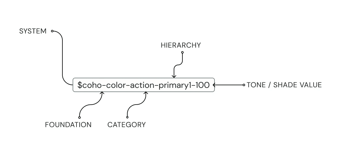
Design System Breakdown: Design Tokens
I implemented numerical values through design tokens as well for documentation. This was important because the purposes of the color values may change over time so, in order to allow for flexibility with scaling values as the design system expands over time, it will maintain clean communication through many iterations.
I implemented numerical values through design tokens as well for documentation. This was important because the purposes of the color values may change over time so, in order to allow for flexibility with scaling values as the design system expands over time, it will maintain clean communication through many iterations.

Design Token
Design Token
Design Token
Design Tokens are used to make it easy to scale components and variables consistently across interfaces and create a common language.
$coho-color-action-primary1-100 = HEX: #883BEB; Opacity: 100%
background: $coho-color-action-primary1-100
Design Tokens are used to make it easy to scale components and variables consistently across interfaces and create a common language.
$coho-color-action-primary1-100 = HEX: #883BEB; Opacity: 100%
background: $coho-color-action-primary1-100
Design Tokens are used to make it easy to scale components and variables consistently across interfaces and create a common language.
$coho-color-action-primary1-100 = HEX: #883BEB; Opacity: 100%
background: $coho-color-action-primary1-100

Numeric Value
Numeric Value
Numeric Value
Used to reference the tone and shade ranges. It’s also used to ensure the system scales if the color changes.
Used to reference the tone and shade ranges. It’s also used to ensure the system scales if the color changes.
Used to reference the tone and shade ranges. It’s also used to ensure the system scales if the color changes.
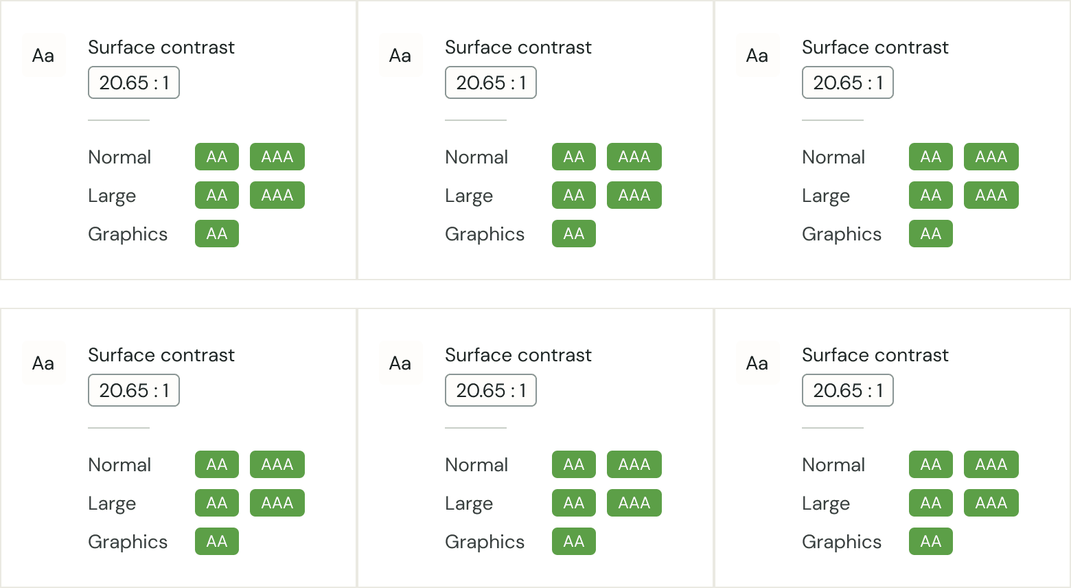
Design System Breakdown: Color System
I split the coho color palette between action, text, surface, and accent colors. I also created feedback states that include the tone and shade ranges of each brand color in the coho system.
This was important for allowing users to differentiate different states, or action states, i.e. default, hover, etc as well as what to use for graphics vs text. Each shade offers feedback to our users so they can navigate our products.
This design system also included industry accessibility contrast ratios based on the AA standards for a pass vs. fail so the team knows when and how to use a specific color value.


Design System Breakdown: Logo System
I organized the type scales into Headings, Body, and Button text. In addition, Coho has a separate type scale for gsuite and documentation use cases since the Brand fonts are from Adobe CC, and often times ops teams would need to use google drive for their use cases.
I organized the type scales into Headings, Body, and Button text. In addition, Coho has a separate type scale for gsuite and documentation use cases since the Brand fonts are from Adobe CC, and often times ops teams would need to use google drive for their use cases.

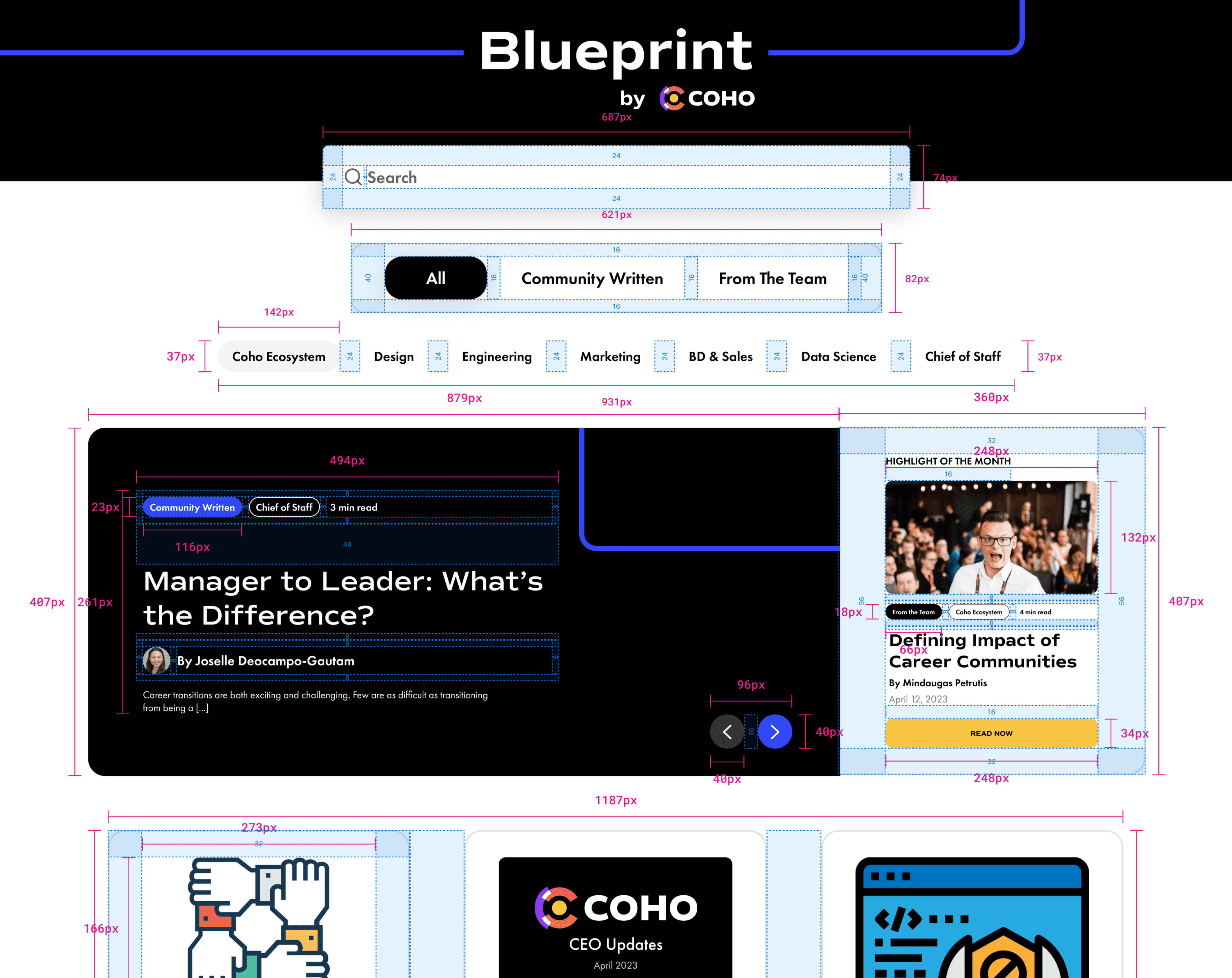
Design System Breakdown: Handoff System
To streamline the design-to-development process, we established a handoff system for smoothly transitioning designed screens into functioning code. This included creating detailed redlines showing spacing, padding, and alignment along with auto-layout specifications for adaptive UI.
To streamline the design-to-development process, we established a handoff system for smoothly transitioning designed screens into functioning code. This included creating detailed redlines showing spacing, padding, and alignment along with auto-layout specifications for adaptive UI.
We also provided labeled examples of how components adapt to different breakpoints. The handoff system enabled engineers to easily inspect redlines, follow auto layout specs, and reference live examples, reducing back-and-forth and accelerating development cycles.
We also provided labeled examples of how components adapt to different breakpoints. The handoff system enabled engineers to easily inspect redlines, follow auto layout specs, and reference live examples, reducing back-and-forth and accelerating development cycles.
Lessons Learned
01 - I underscored the importance of flexibility when designing for a fast-paced startup environment
02 - Training folks on a common language takes time and consistent feedback
01 - I underscored the importance of flexibility when designing for a fast-paced startup environment
02 - Training folks on a common language takes time and consistent feedback
Conclusion
Establishing adaptable governance is critical for an early design system. By accounting for diverse users and integrating into workflows, it can empower both system contributors and consumers. Overall, this design system proved instrumental in maintaining brand consistency and quality while fostering efficient collaboration for Coho's early team.
Establishing adaptable governance is critical for an early design system. By accounting for diverse users and integrating into workflows, it can empower both system contributors and consumers. Overall, this design system proved instrumental in maintaining brand consistency and quality while fostering efficient collaboration for Coho's early team.
Next project
Next project
Next project