Get 8+ Premium Framer Templates
Listen to Onward Upward Podcast!
Listen to Onward Upward Podcast!
Listen to Onward Upward Podcast!
Listen to Onward Upward Podcast!
Listen to Onward Upward Podcast!
Listen to Onward Upward Podcast!
Get 8+ Premium Framer Templates
Listen to Onward Upward Podcast!
Listen to Onward Upward Podcast!
Listen to Onward Upward Podcast!
Listen to Onward Upward Podcast!
Listen to Onward Upward Podcast!
Listen to Onward Upward Podcast!
Blueprint by Coho Blog Responsive Web Design
Designed a blog website to provide the Coho community with candid career advice and real-world insights directly from tech industry leaders.
Brand Designer
UX/UI Designer
Brand Designer
UX/UI Designer
Brand Designer
UX/UI Designer
Website Design
Brand Design
Website Design
Brand Design
Website Design
Brand Design
Designer: Sierra Ching (me)
Marketing/Growth: Kasra Khalili
CEO: Mindaugas Petrutis
Engineer: Keith Wealleans
Designer: Sierra Ching (me)
Marketing/Growth: Kasra Khalili
CEO: Mindaugas Petrutis
Engineer: Keith Wealleans
Designer: Sierra Ching (me)
Marketing/Growth: Kasra Khalili
CEO: Mindaugas Petrutis
Engineer: Keith Wealleans
The genesis of Blueprint emerged from countless conversations within the Coho community. While the startup offered education and events, we saw an opportunity to provide more tactical advice and insights.
After months of ideation, the concept crystalized - a blog that shared frameworks for career strategies from industry leaders across tech. Engineering, marketing, product, design - Blueprint would cover it all.
After months of ideation, the concept crystalized - a blog that shared frameworks for career strategies from industry leaders across tech. Engineering, marketing, product, design - Blueprint would cover it all.
As lead designer, I was tasked with bringing this vision to life. I kicked off by establishing Blueprint's brand identity and designing the site experience. Through collaborate brainstorming, we landed on a modern yet approachable aesthetic that felt trustworthy.
I interviewed users to identify key content needs and pain points. These insights guided the information architecture and user flows.
My priority was crafting intuitive navigation so readers could easily discover relevant advice.
My priority was crafting intuitive navigation so readers could easily discover relevant advice.
"Moving up seems impossible without access to the 'unwritten rules' and strategies leaders used to advance their careers."
"Moving up seems impossible without access to the 'unwritten rules' and strategies leaders used to advance their careers."
"Moving up seems impossible without access to the 'unwritten rules' and strategies leaders used to advance their careers."
"It's hard to find credible stories in the sea of content. Relatable experiences from pros could really guide me."
"It's hard to find credible stories in the sea of content. Relatable experiences from pros could really guide me."
"It's hard to find credible stories in the sea of content. Relatable experiences from pros could really guide me."
"I want to give back by sharing my experience, but lack the platform to reach people effectively."
"I want to give back by sharing my experience, but lack the platform to reach people effectively."
"I want to give back by sharing my experience, but lack the platform to reach people effectively."
Solution 01: Feature a New Theme Specific to the Blog
I conducted a branding workshop and collaborated with marketing team to gain insights and deliver concepts for the blogs branding.
I conducted a branding workshop and collaborated with marketing team to gain insights and deliver concepts for the blogs branding.
Since the blog focused on information sharing, we went with the concept of blueprints, frameworks, and guides which i explored through visual storytelling.
Since the blog focused on information sharing, we went with the concept of blueprints, frameworks, and guides which i explored through visual storytelling.
Solution 02: Responsive Web Design For a Blog
Web Design started with Information architecture, wireframes, and then high fidelity designs. One of the main features would be an intuitive navigation through tags, chips, and search function.
Web Design started with information architecture, wireframes, and then high fidelity designs. One of the main features would be an intuitive navigation through tags, chips, and search function.
Information Architecture
Based on the user needs as well as the marketing team goals, I set out to organize the landing page in order to showcase Blueprint's value proposition by providing intuitive access to the latest career advice.
Key elements included:
• Prominent Search Bar - allows quick access to articles through natural language queries
• Featured Articles - displays 3-5 preview cards to trending or new articles to highlight fresh content. Tags indicate topics for easy scanning as well.
• Tabbed Browsing Sections - allows browsing featured articles or fellowship specific content by tabbed organization
• Optimizing for multiple devices - crafting a responsive web design
Wireframes
With the structure mapped, I wireframed core pages and iterated based on user feedback and stakeholder alignment. I focused on designing for the key elements, knowing that was key to solving the user pain points.
With the structure mapped, I wireframed core pages and iterated based on user feedback and stakeholder alignment. I focused on designing for the key elements, knowing that was key to solving the user pain points.
High Fidelity Designs
Finally, I elevated the high-fidelity visual designs. I used color, typography, cards, chips, search, whitespace, CTA buttons, and branding illustrations to achieve a clean, easy-to-digest reading experience.
Finally, I elevated the high-fidelity visual designs. I used color, typography, cards, chips, search, whitespace, CTA buttons, and branding illustrations to achieve a clean, easy-to-digest reading experience.
Web Design Handoff
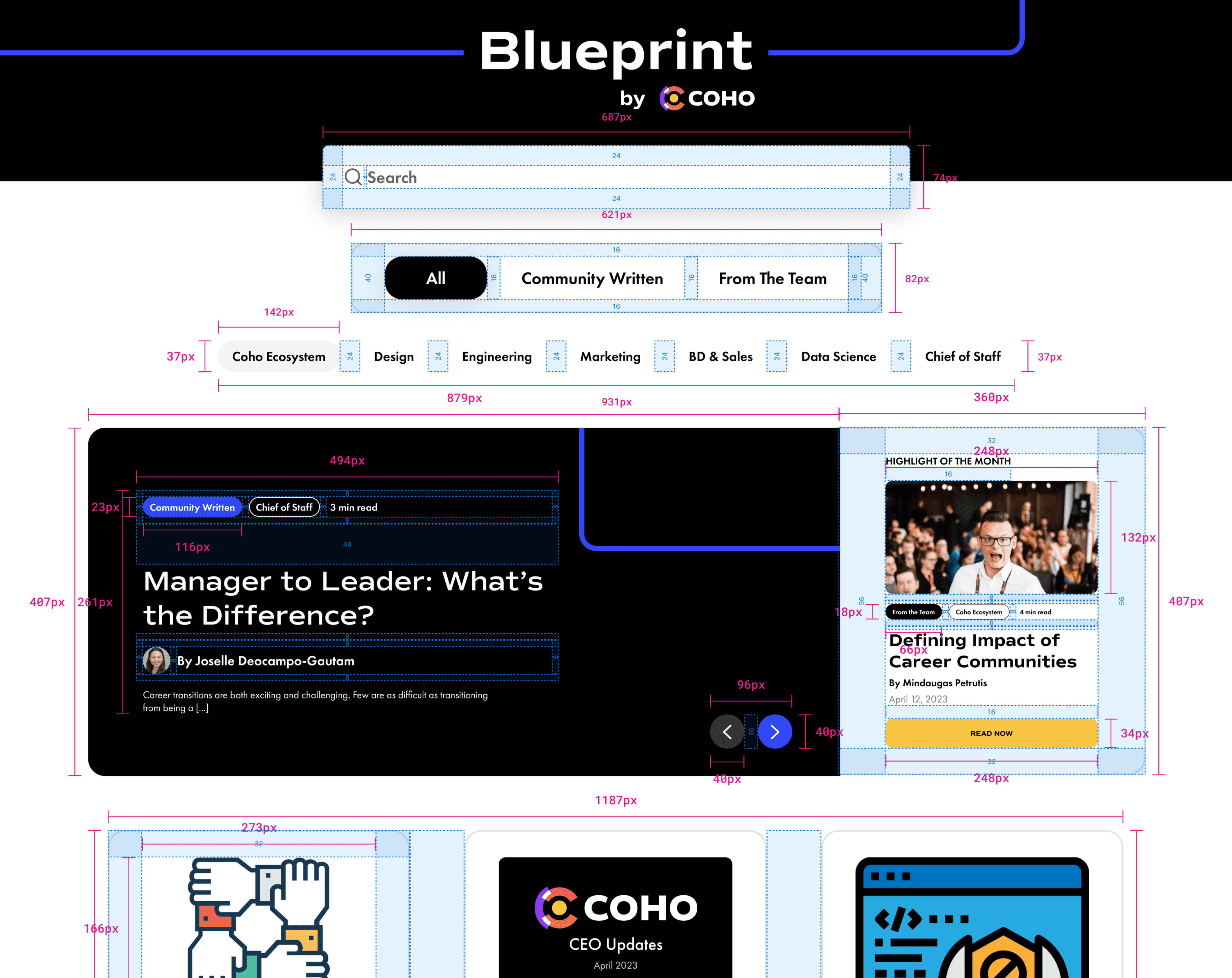
To streamline the design-to-development process, I used a handoff system for smoothly transitioning designed screens into functioning code. This included creating detailed redlines showing spacing, padding, and alignment along with auto-layout specifications for adaptive UI.
Note: This was before the new Figma variables and handoff features were available.
Lessons Learned
01 - Robust search and tagging is crucial for content heavy sites.
02 - Prioritize mobile-first responsive design from the start during the Informatione Architecture stage.
01 - Robust search and tagging is crucial for content heavy sites.
02 - Prioritize mobile-first responsive design from the start during the Informatione Architecture stage.
Conclusion
The collaborative product design process resulted in an intuitive yet engaging platform for Blueprint's career advice content where community members could contribute and the general public could consume content.
While a digital presence is always evolving, we established a strong foundation rooted in user needs. Most importantly, Blueprint provides the Coho community with real-world insights to progress in their careers. And that makes the effort all worthwhile.


